Only the things you would notice. Fixes to seeders, consoles and plumbing are not here — an entry earns its place by changing something you can see or do.
Thursday, September 10, 2026
Site
One colour means one thing
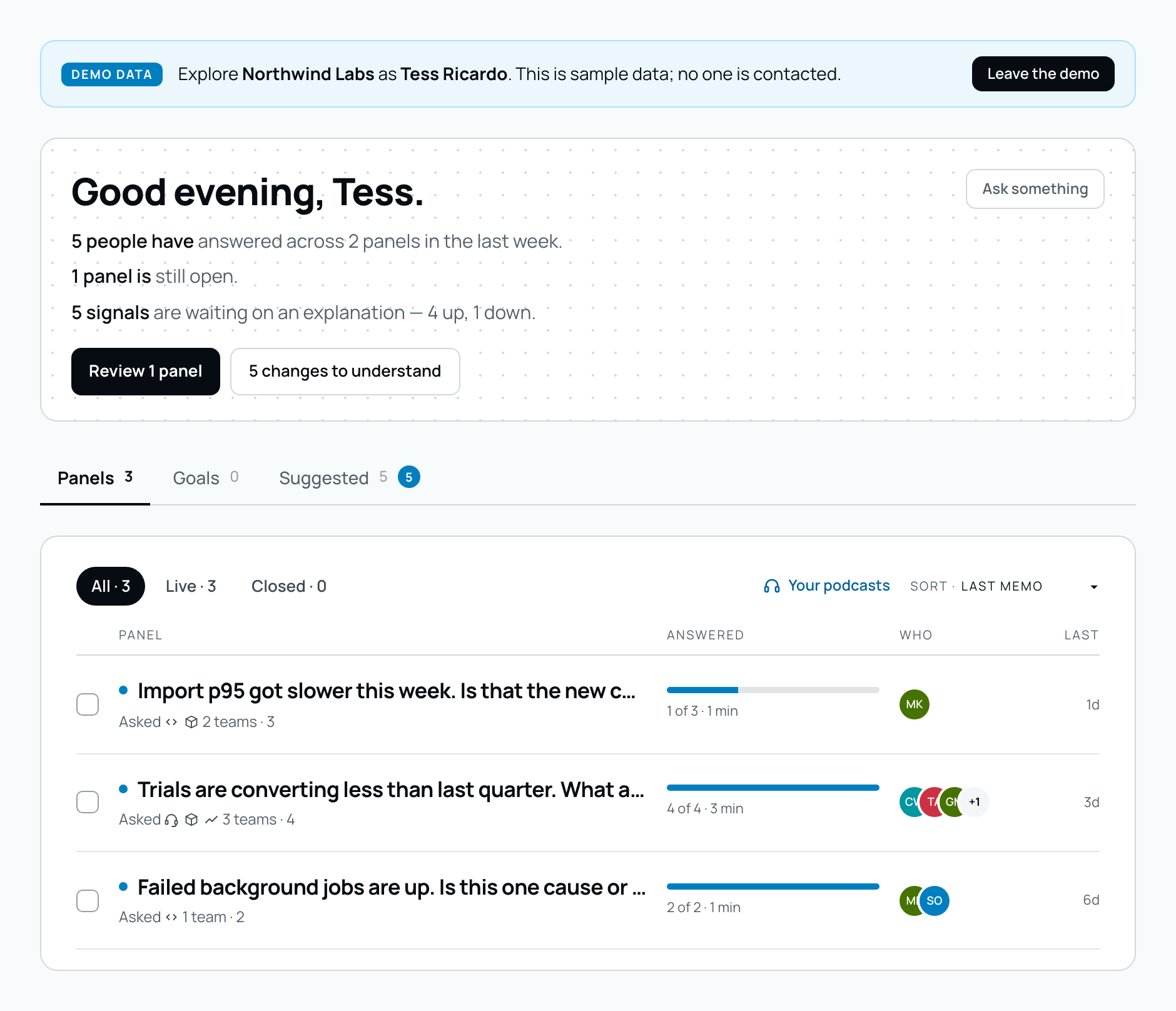
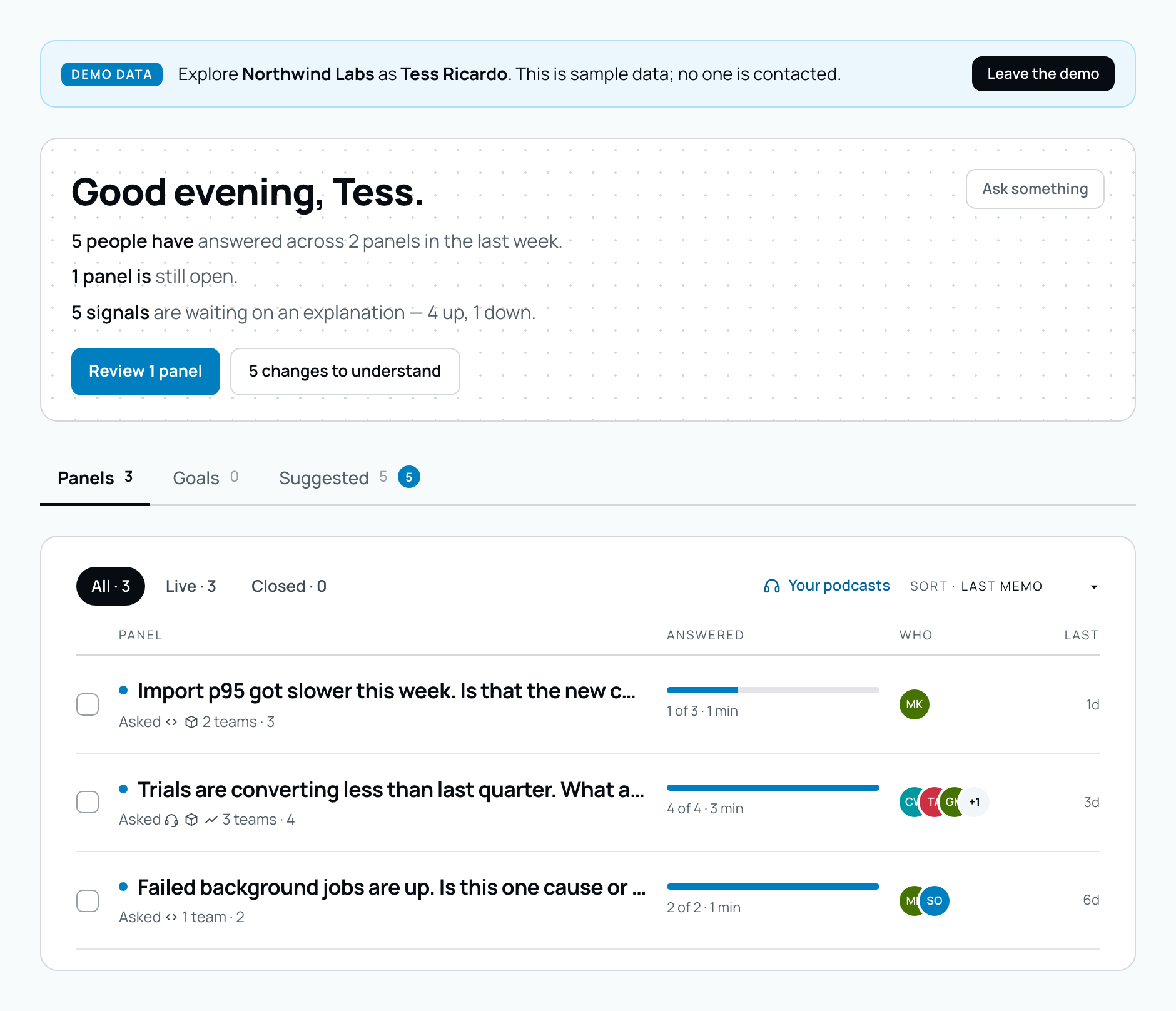
Two different filled buttons were both being used for “the main action here” — black in some places, blue in others — so there was no way to learn which one meant it. Blue now means the thing a block is for, a bordered button means a real alternative, and plain text means minor and reversible. Black survives in exactly one job: sitting on a blue background, where a blue button would disappear. It marks contrast, not importance.
Before
After
The daily brief. “Review 1 panel” takes the primary blue; the second action becomes an ordinary bordered button instead of borrowing the tint that status pills use elsewhere.Panels
Anything waiting on you is warm
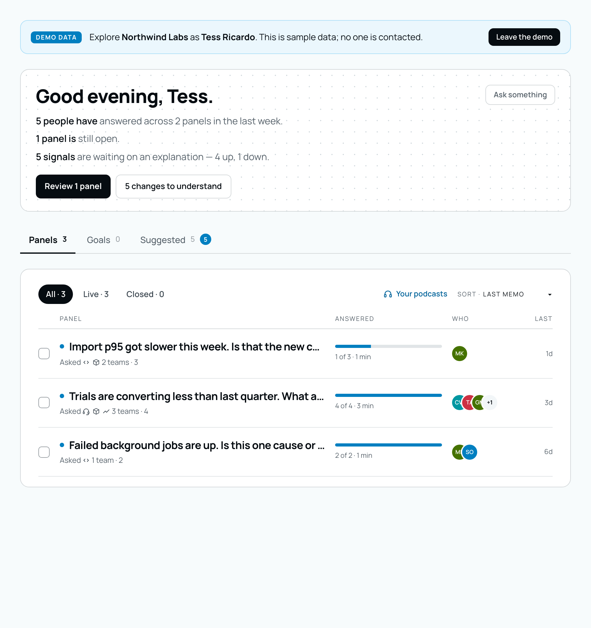
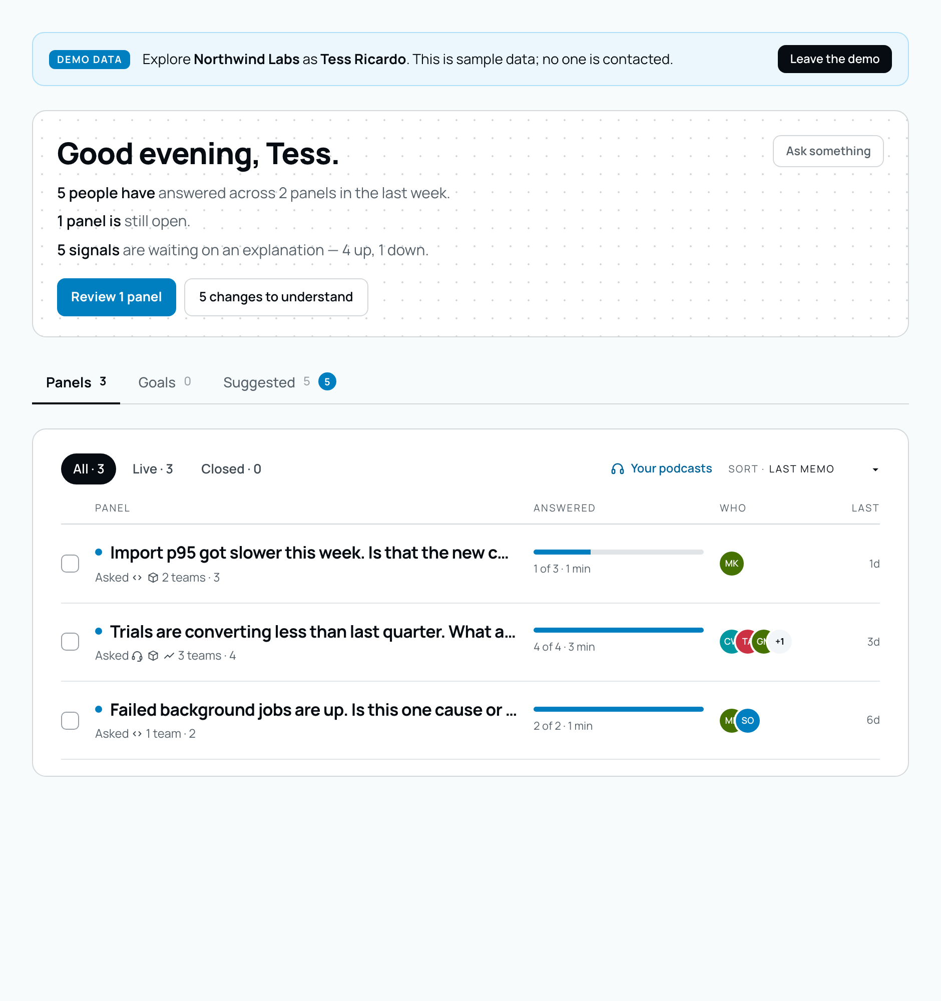
A panel that needs your answer, a metric that moved, a source still collecting — all of these were drawn in a colour named “peach” that was actually blue, the same hue as every button. They are now genuinely warm, and they mean one thing between them: this wants you. Nothing about the colour says whether a change is good or bad, which is still not ours to decide.
Before
After
Progress and attention states on the panel list.Setup
Errors look like errors
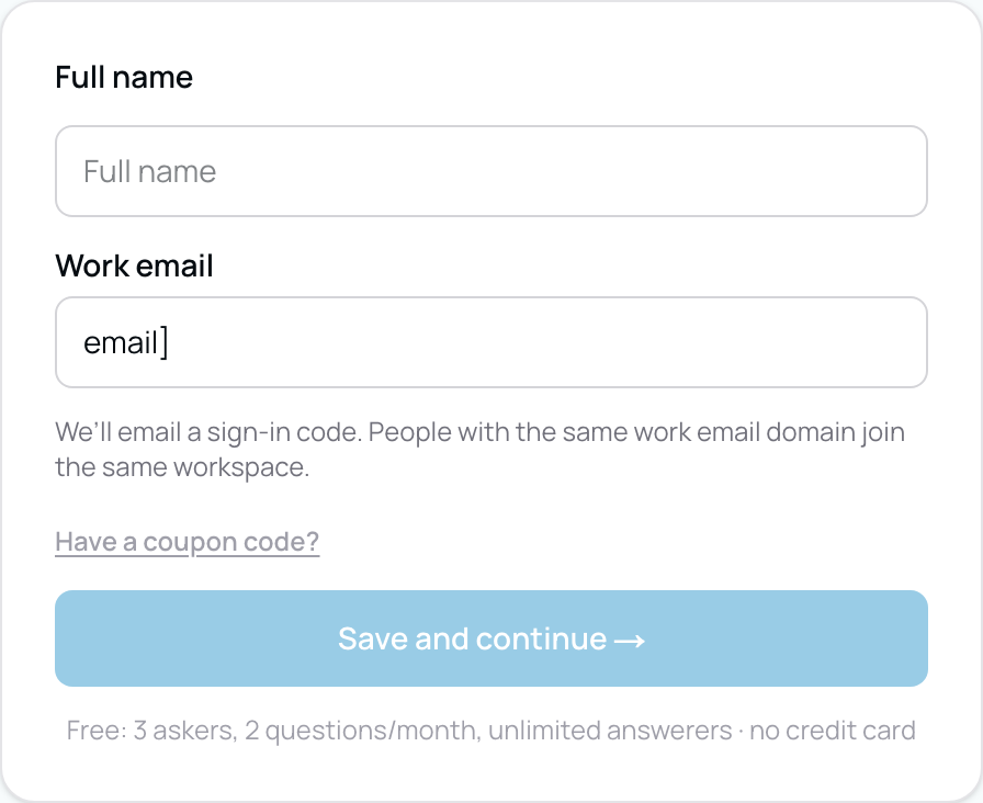
Sign-up validation was drawn in the same blue as the button beside it, so “that address won’t work” read as decoration rather than a problem — and half of it was styled with colours that had never been defined, so the message fell back to ordinary body text. Errors are red now, and the red was already in the palette waiting to be used.
Now
How a rejected work address reads now. The previous version is described rather than shown — it predates these screenshots.
Wednesday, September 9, 2026
Signals
Each category says what is happening, and how far things moved
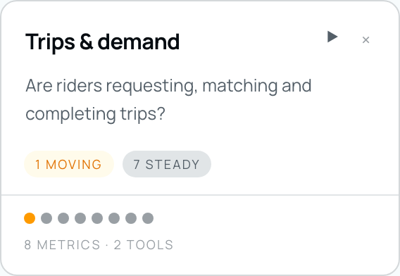
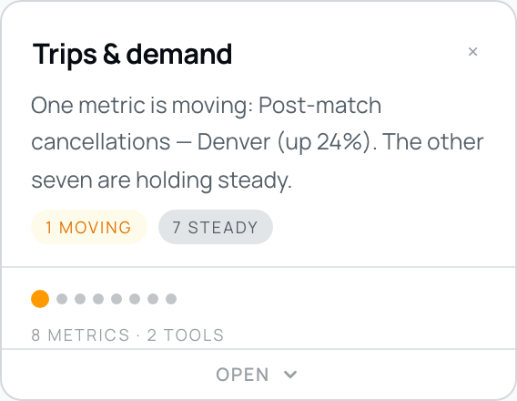
The line under a category name used to be a standing question — true on the week everything was fine and the week three numbers fell, so after twice nobody read it. It now describes the state of those metrics: which are moving, by how much, and how many are not. The dots underneath are sized by how far each metric moved, so a column with one number off a cliff looks different from a column with several drifting together. Neither says whether a move is good news; whether rising work orders is a problem depends on what your team was trying to do that week.
Before
After
The same category, before and after. The open control also moved to the foot of the card, where it lifts the thing it opens.Panels
The composer asks about a change, not for a query
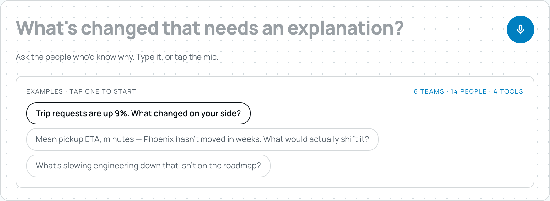
“What do you want to know?” is what a chatbot asks, and it asks it because the thing answering is the machine. Here it is a colleague, and the subject is a number somebody is already watching — so the field says so, and the line beneath it names who will answer.
Now
Signals
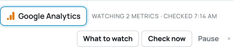
A connected tool glows at its edge
Connected tools carried a small blue dot, which is the convention for “this is powered on” and reads as a status light bolted onto a button. The button's own edge now breathes instead, and a tool that is connected but pointed at nothing keeps a steady blue border rather than a pulsing one.
Now
Demos
Live demos you can pick from, with a walkthrough
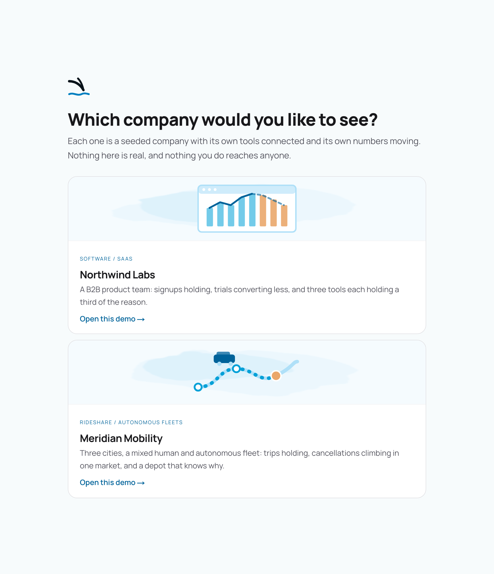
There is now a demo per industry — a B2B product team and a rideshare and autonomous fleet operator, each a seeded company with its own tools connected, its own numbers moving and its own answered panels. Each one opens on the company and the trouble it is in, then walks you through Signals, Integrations, Panels, the brief and the Leaderboard, pointing at the real thing on each screen rather than at the menu.
Now
Podcasts
Podcasts on a schedule, delivered how you choose
You can set a standing episode — weekly, fortnightly or monthly, on the day and hour you pick, in your own timezone — covering the answers across your panels. It always appears in Swoop; email and text delivery are each opt-in. An episode now keeps playing while you move around the product, so you can listen to it while reading the panels it is about.
Panels
The share button says who can open a brief
Every panel starts private, which is the answer people are least likely to guess, and the only way to check was to open the share menu. The button now carries the current setting — Only me, Contributors or Whole org — and calls out the private state, because that is the one where sending somebody the link achieves nothing.
Signals
A star rating can raise a signal
Detection discarded any metric whose value and whose movement were both under five. That is right for a count — three signups becoming five is sixty-six per cent of nothing — and wrong for a rating, which lives its whole life under five by definition. Google ratings could be connected, watched and charted, and could never once raise a signal. They now can.
Site
Integration pages are shorter, and named for what you arrived with
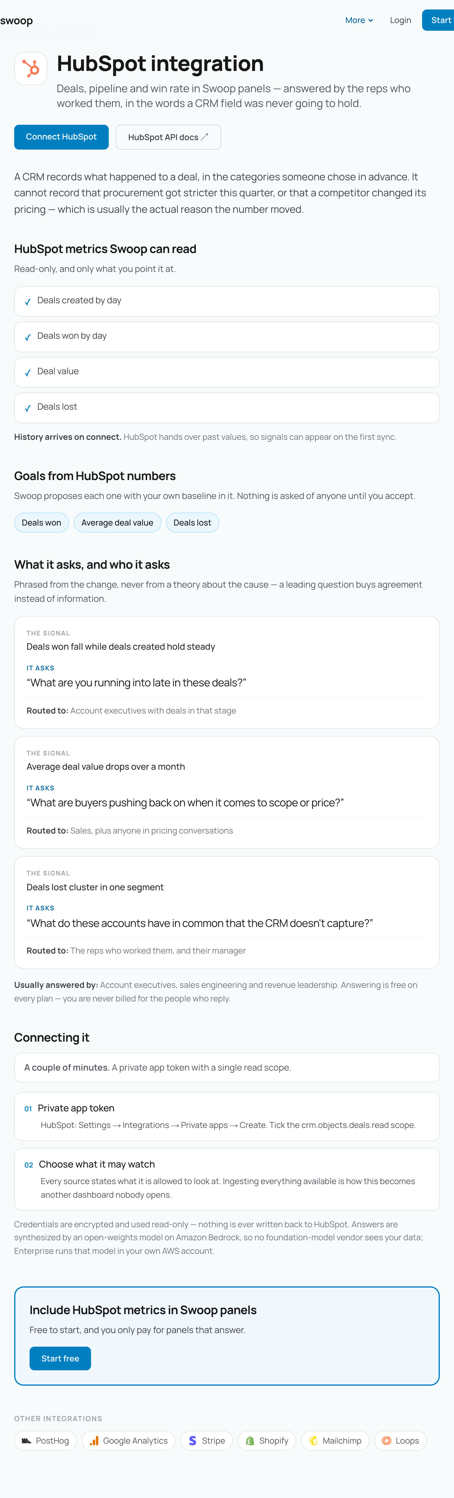
“Connect HubSpot and ask your first question” describes our ritual to somebody who has never used Swoop. Every integration page now leads with your metrics instead — what they are, where they end up, and who would answer when one moves.
Now
Setup
The preview reads your site and shows you back
Asking what Swoop would ask your team used to be two stacked boxes, with the form you had already filled in keeping as much weight as the answer. It is one card now, led by your own company's mark and pulled from the same read of your public site — no account, no connections, and nothing sent to anybody else to fetch it.
Something here not behaving the way it reads? Tell us. A person reads it.